Turn your iPhone into a dumb phone.
← back ——— Harrison Broadbent, published May 14 2024In this article I show you how to turn your iPhone into a dumb phone, using a handful of simple apps and settings.
You don’t have to purchase a new device just to simplify your screen time! You can use your existing iPhone to enjoy many of the same benefits.
Update: I’ve also published another article digging into some of the science supporting the tactics in this article — The science behind an iPhone dumb phone.
Table of Contents
introduction
So, you want to reduce your screentime, maybe embrace some digital minimalism, but you don’t want to go full-on dumbphone.
Perhaps, like most people, you need a smartphone to fully engage with society (like with QR menus, the bane of the dumbphone life!).
Fortunately, you can tweak your current iPhone to dumb it down and transform it from a dopamine-driven-slot-machine, into something a bit more tepid. It’s a great way to temper your screen time without requiring a new (dumb)phone.
 Follow along with this article to dumb-down your iPhone.
This article will show you how to dumb down your iPhone, with tweaks like using a minimal homescreen launcher, choosing a plain wallpaper that hides your dock, enabling grayscale mode and disabling notifications. And of course, the final boss — deleting your apps.
Note: The tweaks here might make your phone less appealing, but you’ll still have access to social media, emails, the internet, etc. Dumbing down your iPhone is a great way to dip your toes into a more digitally minimal lifestyle, but it’s not a replacement for a more limited device.
I hope you’re excited to get started! Let’s dive in.
minimal homescreen launcher
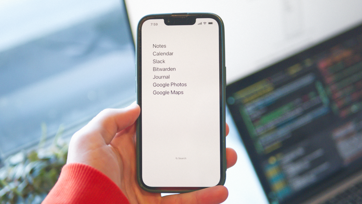
The first thing I recommend is a minimal homescreen launcher — it’s a full-screen widget you place on your homescreen which displays a plain list of selected apps (which you can customize).
I use the Dumbify launcher and it works pretty well. There are a couple of similar launchers, like Blank Spaces and on point, but both have freemium models with expensive ‘premium’ upgrades. Dumbify costs $4.99 USD upfront, but has no in-app purchases; it’s what I use and it’s great.
 The homescreen on my dumbed-down iPhone, using Dumbify.
These homescreen launchers all behave the same — they show a plain list of app names, rather than colorful app icons, which are (hopefully!) less engaging and less likely to distract you.
The freemium apps can be a good way to play around and see if this is something you want to commit to, if you’re uncertain. Just be warned that they’re much more expensive to purchase vs. buying Dumbify once their trials run out.
plain wallpapers (that hide your dock)
A simple, plain wallpaper is another way to simplify your phone. This was a tough one for me! I love displaying pretty photos on my lockscreen, but I decided to go all-in on dumbing down my iPhone.
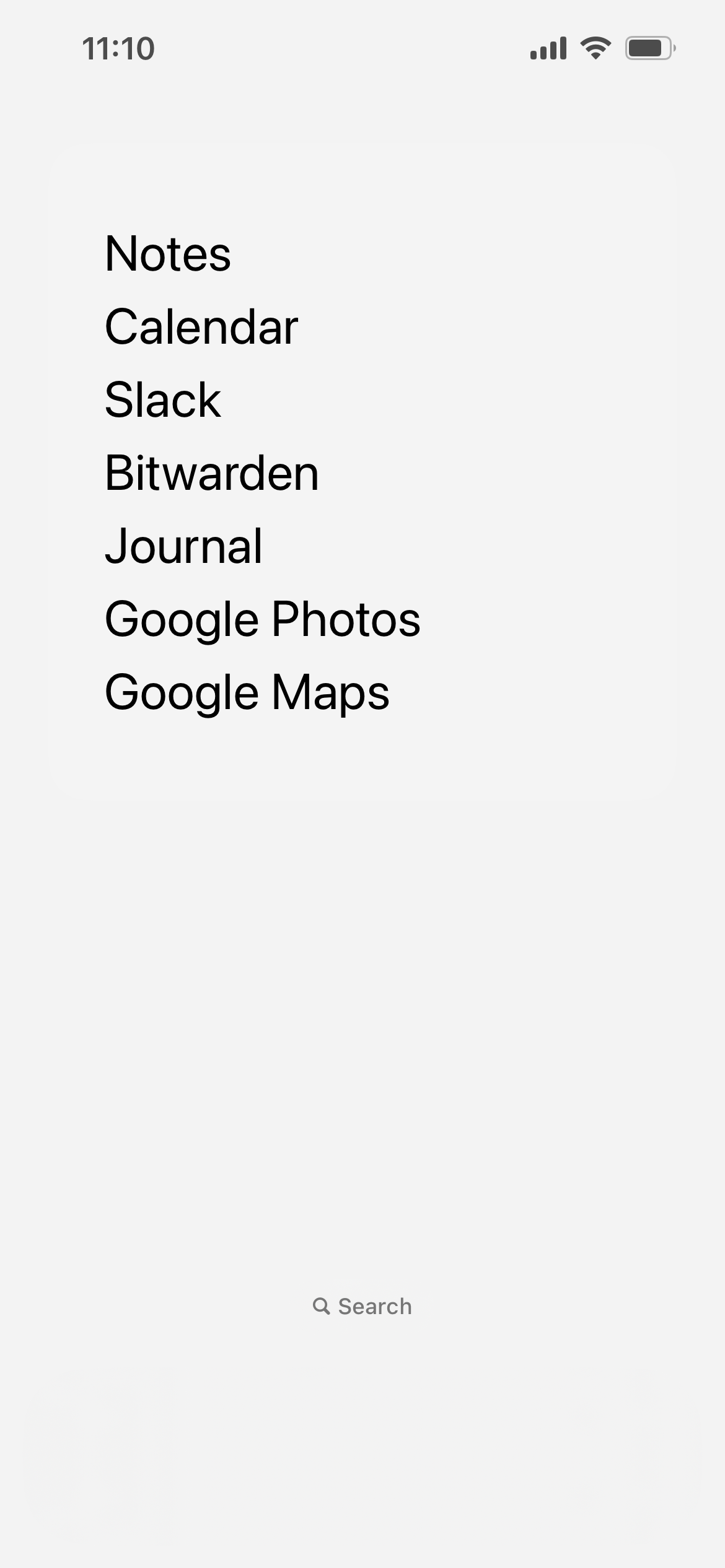
Dumbify includes two wallpapers you can use which match the colors of the iOS dock, and I’ve included them below. By matching with the dock, you can remove all your apps from your dock for an extremely spartan homescreen (like in my screenshot above).
| Dark | Light |
|---|---|
 |
 |
Just tap and hold these photos to save them, crop them to fit your phone screen, and set one as your wallpaper.
You should also make sure to disable automatic light/dark mode, since that adjusts the color of the dock. You can do that via Settings > Display & Brightness > Appearance/Automatic.
Tip: for a completely bare homescreen, you can also turn off the little “Search” badge on your homescreen under
Settings > Home Screen & App Library > Search/Show On Home ScreenNote: I’ve also written about using different iPhone wallpapers for light and dark mode, which is the finishing-touch on a great minimal homescreen setup.
grayscale-only display
The first two suggestions in this article were neat, but not that drastic. This one is!
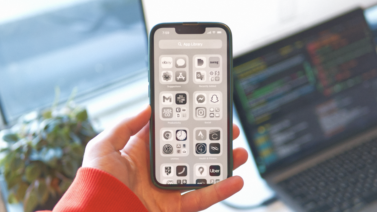
Using an Accessibility setting, you can completely gray-out your iPhone’s screen, which I’ve found has made a noticeable difference to how engaging it is. Doomscrolling on Instagram or TikTok is much less appealing without all the flashy colors!
Recent research agrees with this too — researchers have found that using a grayscale display significantly reduces problematic smartphone usage and anxiety 1.
 My iPhone with the grayscale filter enabled.
Under Settings > Accessibility > Accessability Shortcuts, you can enable the Color Filters option. By default, this will let you enable grayscale mode by triple-clicking your iPhone’s power button. It also has the handy benefit of letting you switch back to color mode with another triple-click.
If you’d prefer to set this directly (maybe you use the shortcut already), you can do that in Settings > Accessibility > Display & Text Size > Color Filters > Grayscale.
Going grayscale is tough! Despite being rather effective, using a grayscale display has been found to be one of the hardest recommendations in this article to stick with.2
Most apps are designed to be experienced in color, and losing it can feel debilitating. If you’re really struggling, consider setting a low saturation level instead (just enough to understand the UI better, but still leaving everything washed-out).
disable notifications
I left this one until (nearly) last since I think it’s pretty obvious.
Disabling (most) notifications was one of the best things I ever did — it’s astounding how many nuisance notifications come through on a given day. Social media pings, random promotions, spam emails — constant interruptions for irrelevant things. Disabling them was cathartic and a huge relief (not surprising, since notifications stress us out).
I do allow a handful of notifications through — phone calls and text messages, as well as my banking apps. Everything else though? 🙅♂️
Apple fortunately makes it straightforward to manage your notifications via Settings > Notifications — you can customize your notification preferences per-app, and if you’re on iOS 15 or later, you can also schedule a notification summary.
Not only is this an obvious adjustment, but it’s an extremely easy one to make. It’s been identified as the easiest adjustment to stick with2 out of the recommendations in this article — you just need to disable notifications once, and then you reap the benefits every day after.
bonus: delete your apps
The bonus tip, the elephant in the room - your apps. You can make all the tweaks to your iPhone that you like, adjust this-and-that, but if you keep your addictive apps around, what’s the point?
Different people find different apps addictive — social media is, of course, a huge one, but the internet (ie: your browser app) can be just as addictive, as can YouTube, Slack and more. Sometimes even Strava sucks me in!
Whatever apps you’re addicted to, just seeing their icons on your iPhone (or being able to search for them) can act as a cue, triggering a little dopamine-driven feedback loop in your brain which sends you spiralling into another doomscrolling session. As effective as little tweaks can be, sometimes the best intervention to break a bad habit is going straight for the cue (the app, in this case).
There’s a handful of popular techniques you can try out — from going cold-turkey and just deleting all your addictive apps to trying out social-media-free weekends, to using the native iOS screen-time feature or more advanced apps like Opal and Jomo to regulate your usage of them.
conclusion
If you’ve read this far, all the way to the end, then thank you.
I have a challenge for you: Implement at least one of the things I’ve covered in this article. Even just doing a little “notification audit”, where you go through your notification settings and disable them for unnecessary apps, can help you reduce interruptions. Likewise, social-media-free weekends can be a great way to cut back on addictive apps without having to completely give them up.
I think it’s important to note though — dumbing down your iPhone is a far cry from a panacea for smartphone addiction. You can turn your iPhone into a ‘dumphone’ all you like, but unless you also delete some apps, you’ll still have access to all your vices — social media, games and more (even if they’re now grayscale). Even if you’re brutal and uninstall everything, you still have the app store and browser beckoning.
That’s not to say that these tweaks aren’t beneficial — I think they are; I think they’re a great set of tweaks to nudge you away from overuse and mindless scrolling — but don’t expect an overnight transformation. For that, you might need to take more drastic measures.
sources
I cited two papers in this article — both are extremely interesting, digestible and worth reading.
In particular, the second paper looks in-depth at a number of the interventions I’ve suggested in this article and includes great insights into how difficult they are to keep up, and how effective they are.
-
Holte, A.J., Giesen, D.T. and Ferraro, F.R. (2023) ‘Color me calm: Grayscale phone setting reduces anxiety and problematic smartphone use’, Current Psychology, Available: https://doi.org/10.1007/s12144-021-02020-y. ↩
-
Olson, J.A. et al. (2023) ‘A Nudge-Based Intervention to Reduce Problematic Smartphone Use: Randomised Controlled Trial’, International Journal of Mental Health and Addiction. Available: https://doi.org/10.1007/s11469-022-00826-w. ↩ ↩2